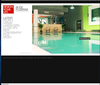
http://album.alexflueras.ro
This is a website for a photographer named Alex Flueras. I think that his website is very clean and slick with the neat lay out of type and large images of his work. This layout is something I will consider when I come to designing my own website.
http://cargocollective.com/paoloboccardi
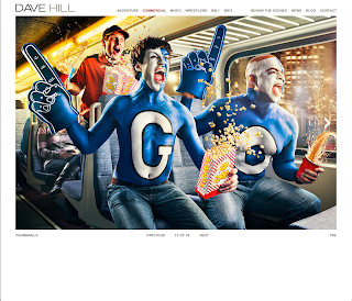 I like the style of this website as it looks very sophisticated and easy to use with the minimal amount of type and more imagery. I would prefer not to clutter my website with too much type to make it appealing to the eye.
http://www.davehillphoto.com/commercial/#4
I like the lay out of this website as it is solely focused on the work and imagery to make it visually appealing to the eye and to make you want to carry on looking through the website. The type and tool bar is almost hidden and the top of the page which makes it neatly presented. However, I think this website could have some more colour injected into it. But then again I think the white and black colour theme makes it classy.
http://mariecatribs.com
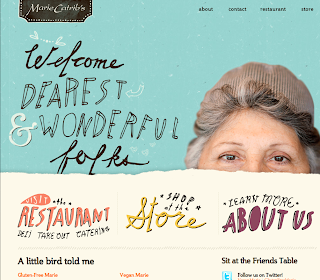
I really liked this illustrated website as I find it quite homely and personal to look at as the type, colours and layouts represents marie catribs personality which is important to show. The type is quite playful and friendly which is something I would like to use on my website. I also liked the fact that when you hover over the face of the women her head pops up with a friendly smile which makes you want to observe her work and discover more about her bubbly personality and business.
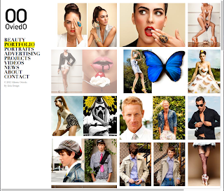
http://www.albertooviedo.com/portfoliofile
I particularly liked the layout of this photography website as all the work is displayed in a collage form which makes it easy and effortless to look at. I also like the black and white theme which makes it classy. The type also looks good set off to the left hand side. I also liked that when you scrolled over the text it highlighted it with an illuminous yellow colour.
http://www.anajuan.net
This was my favourite illustrative website. As you hover over each illustration it comes up with a link to different areas of the website. This is quite fancy, girly and has plenty of nature forms which I find really interesting to observe.


