Wednesday, 7 November 2012

Web File Formats

Today we also researched in to web file formats used in common computer software programmes. I also found examples of flash websites.

HTML-
HTML stands for Hyper Text Markup Language, it uses language/code to create documents on the world wide web.

FLA-
The .fla format is the Macromedia Flash source document for the .swf files. You will need this file if you want to make changes to your Macromedia Flash presentation (the swf files). This can be used on any machine that has the commercial Macromedia Flash editor which is available for Microsoft Windows and the Macintosh.
Here are some example of flash related websites:

http://www.cheeseandburger.com
http://www.knutselwereld.nl
http://awesome.good.is/ecosystem/index.html#/home

CSS- 
This stands for 'Cascading Style Sheet'. Cascading style sheets are used to format the layout of Web pages. They can be used for text styles, table sizes, and the other aspects of Web pages that previously could be defined in a page's HTML.

SWF-
The file format for the playing Flash animation files (Flash movies). The Flash source file, which holds the timelines and multimedia elements, uses the .FLA.

PHP-
This stands for Hypertext Preprocessor, an open source, server-side,HTML embedded scripting language used to create dynamic Web pages.

MySQL-
It is an open source relational database management system. It is based on structure query language (SQL), which is used for adding, removing, and modifying information in the database.

FTP-
This is short for File Transfer Protocol, the protocol for exchanging files over the internet.

HTTP- 
It provides a standard for Web browsers and servers to communicate.


File Formats

In todays web lesson I have researched in to different common file formats which are used with popular software programmes such as Photoshop, Illustrator, In-Design etc.

GIF -
The letter GIF stands for 'Graphics Interchange Format'. GIF is a compressed image file format. GIF files are great for small icons and animated images, but they lack the colour range to be used for high quality photo's.

TIFF-
This stands for Tagged Image File Format. It is a bitmapped graphics file format for Adobe. It's widely used in book publishing and other print related industries.

PNG-
This is a compressed raster graphic format. It is commonly used on the Web and is also a popular option for application graphics.

PDF- 
This was developed by Adobe Systems. PDF is a file format that preserves most attributes (including colour, formatting, graphics, and more) of a source document no matter which application, platform and hardware type was originally used to create it.

PSD- 
The psd format is the Adobe Photoshop data format which can be read on any machine that has installed Adobe Photoshop. It can be used on both Macs and also PCs.

IND-
Adobe In Design document file

XLS-
The original file extension used for Microsoft Excel spreadsheets. Starting with Excel 2007, the default file format for worksheets without macros changed to Office Open XML with an XLSX extension.

RAW- 
A raw file is a document of unprocessed data. This means the file has not been altered, compressed or manipulated in any way. A common type of raw file is 'Camera Raw' which is created by a digital camera.

Ai-
AI is a file for a vector graphics file format used in Adobe Illustrator drawing.

Doc-
A file which is created in a version of Microsoft's word processing application. DOC file use a .DOC extension and differ from text files.

JPG- 
JPG is better than GIF for photos as GIF files can only have 256 different colours as where as JPG have millions which means GIF files would be more pixelated than JPG files.

PPT- 
This is a file extension for a presentation file format used by Microsoft PowerPoint. All text images, sound and video used in the presentation are contained in the PPT file.


Wednesday, 17 October 2012

Existing web design research

Today we have researched into existing websites of portfolio's of photography and illustration. This is in preparation for identifying the style of website I may want to produce. I have taken some screen shots of my favourites which I'd like to display to you all.


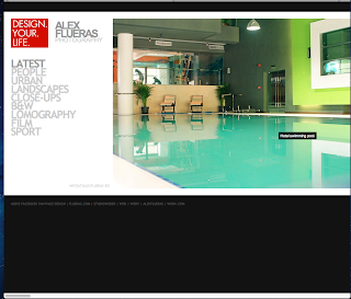
http://album.alexflueras.ro
This is a website for a photographer  named Alex Flueras. I think that his website is very clean and slick with the neat lay out of type and large images of his work. This layout is something I will consider when I come to designing my own website.


http://cargocollective.com/paoloboccardi
I like the style of this website as it looks very sophisticated and easy to use with the minimal amount of type and more imagery. I would prefer not to clutter my website with too much type to make it appealing to the eye.


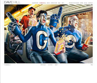
http://www.davehillphoto.com/commercial/#4
I like the lay out of this website as it is solely focused on the work and imagery to make it visually appealing to the eye and to make you want to carry on looking through the website. The type and tool bar is almost hidden and the top of the page which makes it neatly presented. However, I think this website could have some more colour injected into it. But then again I think the white and black colour theme makes it classy.


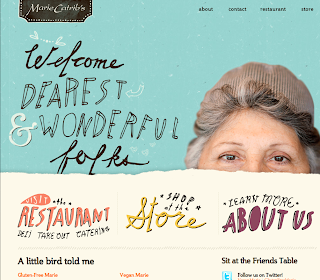
http://mariecatribs.com
I really liked this illustrated website as I find it quite homely and personal to look at as the type, colours and layouts represents marie catribs personality which is important to show. The type is quite playful and friendly which is something I would like to use on my website. I also liked the fact that when you hover over the face of the women her head pops up with a friendly smile which makes you want to observe her work and discover more about her bubbly personality and business.


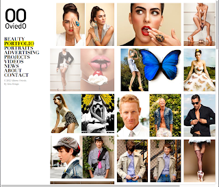
http://www.albertooviedo.com/portfoliofile

I particularly liked the layout of this photography website as all the work is displayed in a collage form which makes it easy and effortless to look at. I also like the black and white theme which makes it classy. The type also looks good set off to the left hand side. I also liked that when you scrolled over the text it highlighted it with an illuminous yellow colour.

http://www.anajuan.net

This was my favourite illustrative website. As you hover over each illustration it comes up with a link to different areas of the website. This is quite fancy, girly and has plenty of nature forms which I find really interesting to observe.

Wednesday, 10 October 2012

Adobe Flash Experimentation

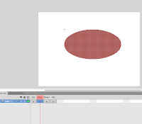
During today's web design class we experimented with the basics of Adobe Flash by making a simple button. Here is the basic step by step of how I made it:

1) Opened Adobe Flash and created a document in the format of action script 2.0
2)Drew a simple shape for example a circle using the tool box
3)Converted the shape into a symbol by doing the process 'modify' > 'convert to symbol'
4)Double clicked on the shape I created and the new timeline appeared
5)Then went to 'Insert' > 'Timeline' > 'Keyframe' which was repeated 4 times as well as changing each colour on the shapes for 'up', 'over' 'down' but leave the section 'hit'
6)Also I added any type which I wanted to identify the buttons use
7)I copied the type so it was the same for each section (Ctrl+C)
8)Clicked on the 'over' and hit Shift > Ctrl >V. This placed the type in the exact same position as the previous one
9) I also changed the colour of the type incase the text clashed with the colour of the shape (button)

Wednesday, 26 September 2012

SouthBank Trip

Last week my college visited SouthBank and Borough Market relevant to our current advertising project. We have been researching about all these different attractions and then we visited these places to see them first hand.

Firstly we visited Borough Market where we got to experience the tastes and smells of the different cuisines available to buy from the different stall holders. For my lunch I had a bratwurst hot dog which was the biggest one I've ever had. I also sampled different cheeses, seafood and cakes which left me feeling rather stuffed. I loved the brownies so much I purchased some for my friends and family. I really enjoyed the buzz around Borough Market and would recommend anyone to visit for a first hand, fresh, homemade food. All the stall holders were very friendly and so warm and inviting. The presentation of their stalls was also magnificent that could not turn you away. My friend also got offered an illustration opportunity to design packaging for a new fudge range which she was exceptionally happy with.

Then carried our journey along SouthBank along the River Thames where we visited several different art museums such as Tate Modern, Hayward Gallery. We also passed the OXO tower and took photographs for our projects of all the different attractions. We also visited the National Theatre skate park where we observed the amazing graffiti art and the talented bikers. Our group also stopped along near the London eye and took photographs and also watched the street entertainers.

Overall, the trip was very helpful to my current project and also my research that comes with it. It also helped give me a better insight to the feel, mood and culture of SouthBank which I will take into consideration when designing my advertising poster.

Wednesday, 19 September 2012

Web Design HTML

We created our first basic webpage by using the HTML method and exploring different codes. This has introduced me to web design which will help strengthen my graphic design knowledge. I will identify the different codes to understand about how I constructed my webpage together.

HTML: Hyper Text Markup Language

<p> stands for paragraph
<h1> the 'h' represents heading


H1 is a top largest heading
H2 is a little smaller
H3
H4
H5 are heading that decrease in size as the number increases


Example:

<h1>Heading1</h1>
<h2>Heading2</h2>
<h3>Heading3</h3>
<h4>Heading4</h4>
<h5>Heading5</h5>


Heading1

Heading2

Heading3

Heading4

Heading5

Wednesday, 12 September 2012

Progression Route

I would like to continue my studies at Canterbury College after my BTEC Extended Diploma and do a Higher National Diploma in Graphic Design Level 5. This will help me gain more experience and build a strong individual portfolio to help me gain employment in the future.
I will be visiting the open day at college on the 7th November 2012 to give myself an insight to what the course has to offer.

I will learn about typographic design, ideas and context, critical studies, applications and digital media which I look forward to discovering and progressing with. I am also looking forward to the work placement in year two as this will help me understand what it will be like to work in the professional industry once I have completed my education.

Wednesday, 5 September 2012

My Summer Holiday

Over my summer holiday I built up two sketchbooks, one personal and one messy. I experimented with lots of different materials and mediums to complete each sketchbook. I loved having the freedom to create whatever I pleased which made it personal to me, I also found it quite therapeutic.


I also visited the south of France over the summer where I used this experience to discover their different cultures of art. I collected some retro postcards of my findings there and I also took photographs of sculptures and signage which I put in my visual sketchbook.


D&AD New Blood Exhibition and London Trip

Welcome to my very first professional blog to kick off my graphics career. I will be posting all of my work and my progression throughout my graphic design course on here to share with you all.

Recently, I visited London with my college class to visit brick lane to study the graffiti art and signage and also the new D&AD New Blood Exhibition. It was a really interesting trip where I got to look at all the different exhibitions of graphics work across the country from different universities. I particularly liked Norwich, Loughborough and Falmouth university as they displayed particularly good illustrative work. I also collected different business cards and freebies from different exhibitions I liked. Many of the university students were very helpful in sharing their experiences at the uni's and offering advice to us for the future.

 I also loved walking round the streets of brick lane to discover different styles of graffiti which I took lots of pictures off. I think that graffiti art has become an new interest of mine since observing some of it in London. For lunch I went to subway with my class mates which left me feeling unfit to move anywhere for the rest of the afternoon.